This article describes interface elements of the ISPsystem control panels.
Authentication
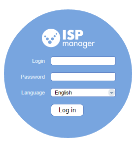
Enter a username and password to login to the control panel.

You can select a language that will be used in the web-interface (menu, messages, hints, and other information). Later you can change your password and interface language in the User settings module.
Dashboard

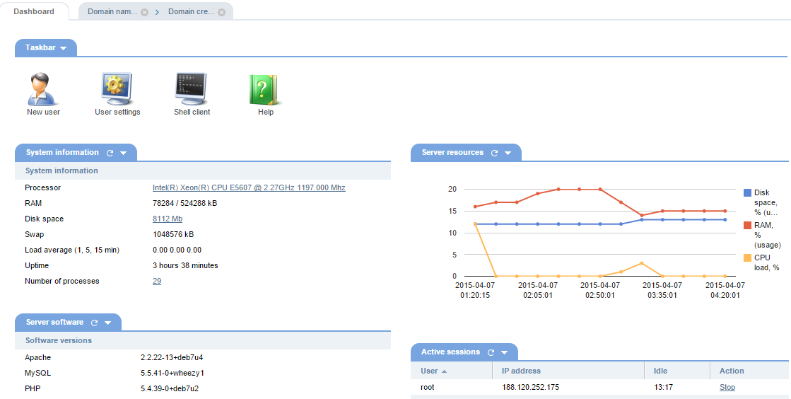
A Dashboard is the main page of a control panel and is the page users come first upon logged in. This page has some sort of table of contents giving information about the main modules of the system.
The Dashboard contains a Task bar with buttons and links to the main modules of the control panel. Depending on a software product, the icons and links may vary, and show various Information (such as a number of users, sites, traffic usages, etc.). Information can be presented in the form of graphs and charts and can be closed, removed or updated.
Navigation menu
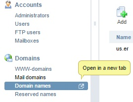
A navigation menu is a navigation header that is placed at the left side of the page. It contains links to the panel modules and helps users in traveling through the control panel.
 — show all modules of the control panel.
 — show modules marked as "Favorite". In order to add an interface module to "Favorites", click the yellow star button on the right left of the page you want to add.
 — show the frequently accessed menu modules.
 — show all the tabs in categories.
 — hide the tabs to save space, show only categories. When you open the panel next time, the categories will remain hidden (settings are saved in Cookies of your browser).
 — hide the navigation menu. Hovering a mouse cursor over the left side of the panel, will open the menu. Clicking the icon once again will make the menu visible.
The navigation menu also contains a search bar allowing users to quickly find a module.
Table (list of elements)
To perform an operation in the table, select one or multiple raws and click the corresponding button on the toolbar. To select a group of elements, you can use the following buttons:
Ctrl — select a number of raws.
Shift —  to select a group of elements, click the first item, press and hold down the Shift key, and then click the last item.
Some button may be inactive meaning that the operation cannot be performed against that element. Select the element, and the button will get activated. However, in some circumstances, the buttons may remain inactive (sometimes, the reasons can be found in hints).
In the User settings module, you can change the number of rows displayed per page. This will help you work with tables containing too many raws.

Clicking the names of the raws will sort data in the table. Information can be sorted out by one or multiple columns.
At the bottom of the table, you can see statistical information about the table's elements. If no raws are selected, information is displayed for all the raws, otherwise — only for the selected elements.
Tabs
You can open multiple tabs at the same time, switch between them easily, and close the modules you don't need anymore.
Use the following shortcuts:
 CTRL + SHIFT + Z — show all the tabs.
 CTRL + SHIFT + X — hide all the tabs, except the active one.


Form
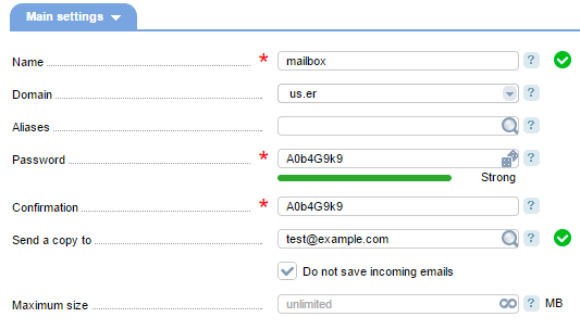
A form is used for performing a number of operations in the control panel, and may contain the following types of fields:

 * text field,
 * drop-down list,
 * password input field,
 * check box,
 * radio-buttons.
 * slider
If multiple values can be entered into the form, you will see the icon  . Click the icon to extend the text field. Text fields where you can enter numerical values have the icon
  allowing to set unlimited values.
Each field has an example of correct information that should be entered. If you are entering valid information, the icon  will be shown next to the field. Otherwise, you will see a red-color banner describing the error and giving a correct variant.
In the "Password" field you should enter a password to log in to the system. The password can be randomly generated by the system. To get one, click the icon  next to the field. With the icons
  and
and  you can easily enable the browser to show or hide the password, so you don't type it incorrectly. Depending on its strength, the password will be underlined with a certain color (green — strong password, yellow — medium, red — weak).
Mandatory fields are marked with an asterisk. All the fields have hints, which are shown either when putting the mouse cursor on the input field, or when moving the mouse cursor over the hint icon  .
.
Some forms are shown as Wizards containing multiple steps enabling a user to switch between steps if needed, and all the information he provides won't get lost.
Toolbar
A toolbar contains a number of buttons on the left and right sides that can be used for various operations.

On the left, you can see the buttons for performing operations depending on a certain module. More information about each button can be found in the Documentation.
 — refresh the table. You can also click the heading to refresh it.
 — add the module into "Favorites" (click "Favorites" on the left-side menu to see a complete list).
 — select all the table elements.
 — save data in CSV.
 — disable list auto-update.
 — print the information.
 — open the table settings form.
Set filters
You may set filters to easily search the information you need.
Click the icon  at the top-left of the panel interface. Depending on a module, you can search for information by various parameters:

- Cntr+Shift+F — text search within the current page.
- Search — search by certain parameters.
- Save filter — save selected parameters.
- Clear — delete all the data in the form.
Help
Hints
All fields have hints, which are shown either when putting the mouse cursor on the input field, or when moving the mouse cursor over the hint icon.
To get information about a certain module of the control panel in Documentation, click the "Help" icon  .
.
Useful links
In some modules, you can see links to useful articles where you can find detailed information about setup, configuration, etc.

Banners
There are a number of Informational banners and messages, shown in various colors. Read — error, yellow — warning, green — information
Progress bar
A progress bar is a graphical control element used to visualize the progression of extended operations. The operation is divided into steps and is accompanied by a textual representation.
Notification bar
A notification bar allows for more fluid and faster browsing in the control panel. Notification icons are consolidated in the Notification Bar, located at the top of the interface, and may show such information as the number of tickets in Support center, the number of services in the Shopping cart, and much more.
Keyboard Shortcuts
General
CTRL + SHIFT + M — give focus to the search bar of the main navigation menu
CTRL + SHIFT + Z — close all tabs
CTRL + SHIFT + X — close all tabs, but the active one
List elements
CTRL + SHIFT + A — select/unselect all elements in the list
CTRL + SHIFT + F — give focus to the search bar
 En
En
 Es
Es